Amazon Ads - Communication Settings 2.0

My intern project for Summer 2022 was to redesign and optimize the Communication Settings page for our advertisers. The goal was for advertisers to easily access and tailor their communication preferences in order to personalize their experience using our platform. This project was completed over the course of 12-weeks.

Client

Amazon Ads

Type

Internship

Year

2022

The Ask

I was tasked with optimizing the Communication Settings page in order to align with the following P0 goals.
1. Increase adoption

Explore ways to increase adoption of Communication Settings page across the platform, such as identifying new and improved ingresses to the page.

2. Soliciting additional preferences

We want to allow advertisers to specify preferences outside of toggling notifications on/off and updating contact info.

3. Consistency with our current CX

In spite of all these changes, we still want advertisers to be able to specify their current preferences.


Research

Before I could identify ways of optimizing the page, I needed to dive deep into the current CX and identify existing issues.
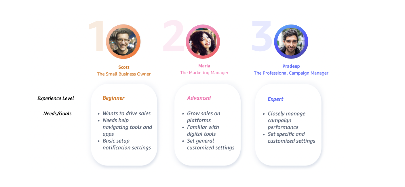
"The current CX on the Comm Settings page was suboptimal for three reasons..."
Heuristic Evaluation
1. Can't set mass preferences

In our current CX, advertisers have to navigate to each tab to adjust settings.

2. Can't set additional preferences

Advertisers can only set up or change their email/phone numbers and toggle preferences on/off based on channel. Other competitors provide more options.

3. Low adoption

Only a small percentage of advertisers who have visited the page have toggled a notification setting on/off

Competitor Audit
I conducted a competitor audit on the Communication Settings for nine (9) competitors. Some high-level findings were that every communication settings page allowed users to adjust their email settings, and many platforms offered personalized settings such as setting the frequency of notifications.
Advertiser VoC (Voice of Customer) Insights
Overall, our advertisers wanted to see more personalized preferences and receive notifications from more mobile-friendly channels.

User Persona

Solution

After identifying the problems with the current CX, I was able to explore potential solutions to best fit our advertisers' needs.
UX Workshop

In order to reach alignment across product, marketing, engineering and design, I led and coordinated a UX workshop. In addition to context setting, the workshop included activities such as "How Might We's", which framed pain points and business goals as actionable solution statements.

From the How Might We exercise, I worked together with designers to narrow down our top votes and create sketches that I could then turn into wireframes.
User Flows
After the workshop, I created new user flows and ingresses based on the flows we saw with the current CX. I focused on exploring as many potential user flows as possible, and identify 3-4 key flows that I would turn into wireframes.

Two Mental Models
As I was working on my wireframes, I began to explore two different mental models for the Communication Settings page. I began to wonder if our users cared more about the notification setting itself, or where the notification was coming from.
Advertiser Personas
These were the three (3) advertiser personas I identified for the Communication Settings page. For the usability testing piece, it was crucial for me to assess whether or not the page was accessible for customers with varying levels of experience.
Cognitive Walkthrough
To help validate my concerns, I conducted a cognitive walkthrough with advertiser proxies. Together, we walked through the two potential solutions to narrow down which mental model felt the most intuitive.
Cognitive Walkthrough Findings
Due to NDA, I can't showcase the final designs. However, please reach out to me over email if you are interested and we can discuss offline.
Results

We had roughly 30 participants over 2 rounds of testing. Participants wanted to have enough information to understand the different pricing between order types in a clear, concise and visible format.

Final Designs

Although participants gravitated towards the pop-up modal in Prototype D, we ultimately went with Prototype B since it had the clearest language and did not disrupt the ordering flow compared to the other options. This option also required the least amount of tech effort, which would allow us to roll-out the differentiated pricing information to our users faster. The copy required some additional refinements to be more short, informative and concise.

Reflections

Set preferences for global marketplaces

This was one of the original goals for the project, but I worked with PMs to narrow down the scope given the timeframe of my project. This would have affected settings like time zone

Set preferences for multiple accounts

Setting preferences for multiple accounts would affect the contact info piece. At this stage, I would think about how to apply mass preferences across multiple accounts

Cooling off period

This was something that had come up after the cog walk, especially around the granularity surrounding the timing of notifications. A cooling off period/do-not-disturb mode might make more sense in this scenario.

Other work

Want to create something awesome? Drop me an email.

→laurenakaari@gmail.com