Shutterstock - Enterprise Music ADP Redesign

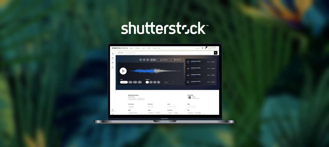
During my time at Shutterstock, I was tasked with redesigning the tracks for the Music Asset Details Page (ADP) for their QA Enterprise experience.

Client

Shutterstock

Type

Internship

Year

2021

The Ask

There were several requirements I was tasked with addressing for the current Music ADP...
1. Consolidate proposed vs. live ADP

Shutterstock had partnered with an agency to redesign the Music ADP before I joined the team, but the agency's design needed to match the current CX that existed on our live site. We also wanted to maintain parity with our design system.

2. Distinct Light Mode/Dark Mode

The light mode version of the Music ADP felt too similar to a dark mode version of the platform. Our instinct was to create a greater distinction, but we wanted to see what our users' preferences were when it came to a light mode or dark mode.

3. Improve waveform/background UI

Inspired by the waveform gradient on the agency's version of the Music ADP, we wanted to look into how we could use visual language such as color to inform the tracks on the page. What should inform the track colors? Would color be relevant to how users interact with the assets on the page?

Live Music ADP (left) and proposed Music ADP (right)
"The design of our Music ADP should be informed by our customers' preferences and assist them in their search for the right audio track."

Research

For the research portion of this case study, I was able to reference written feedback from real customers as well as recordings of user interviews.
User Feedback

The responses I reviewed for the Music ADP revealed some polarizing preferences for light mode/dark mode and waveform...

"I think the waveform is useful for sound effects. I personally like working in dark mode since I'm on the computer all day. I feel like the dark color scheme is more effective at preventing eye strain."

-Debbie, Animator for Viz Media.

"I don't really like using dark mode. I like the feel of Audio Network, since I find the white more calming. I also don't think that the design should take up too much space."

-Steve, Broadcast Engineer & Freelance Video Producer/Director/Editor

User Interviews

The three main insights I gathered from the recorded user interviews I watched...

1. Customers rely on shape of the waveform as opposed to the color
2. Customers with music background/edit audio tracks can see whether a track is a good fit based on waveform.
3. Customers wanted to see 1.) larger waveforms, and 2.) all waveforms.
Competitor Audit

I looked into three different audio streaming platforms for UI inspiration...

Extreme Music

The waveforms for Extreme Music were all single-color, in contrast to the gradients for the pre-existing Music ADP mockup.

Audio Network

Since the Music ADP mockup was dark mode by default, Audio Network had a great example of what a potential light-mode version could look like.

Sound Cloud

SoundCloud had a mix of both single-color waveforms, as well as a gradient background, which appeared to be drawn from the cover image of whatever song was playing.

User Persona

"Finding the right track for a project can sometimes be a long and tricky process."
Core Needs
  • Wants to easily sort through lots of music content.
  • Likes working with both light mode/dark mode during different times of the day.
Pain Points
  • Listening to each audio track on Search Results Page (SRP) can be a time sink
  • The platform can be difficult to navigate if color schemes aren't consistent.

Initial Iterations

Before I could finalize my designs for the Music ADP and waveforms, I created several iterations. I presented these initial iterations to my design team, and improved my subsequent designs based off of their suggestions.

Music ADP
Waveforms

Solution

The process of getting to the finalized version of my mockups involved a lot of iteration.
Waveform

For the waveform color, I had settled on a singular-colored waveform with two variations depending on whether the user was in dark mode or light mode. Both of these colors were derived from pre-existing color links in the Shutterstock design system.

Music ADP

In addition to creating two distinct light modes and dark modes, I also made sure that the usage of the new waveform colors were consistent throughout the page.

Results

We had roughly 30 participants over 2 rounds of testing. Participants wanted to have enough information to understand the different pricing between order types in a clear, concise and visible format.

User Feedback

The responses I reviewed for the Music ADP revealed some polarizing preferences for light mode/dark mode and waveform...

"I think the waveform is useful for sound effects. I personally like working in dark mode since I'm on the computer all day. I feel like the dark color scheme is more effective at preventing eye strain."

-Debbie, Animator for Viz Media.

"I don't really like using dark mode. I like the feel of Audio Network, since I find the white more calming. I also don't think that the design should take up too much space."

-Steve, Broadcast Engineer & Freelance Video Producer/Director/Editor

User Interviews

The three main insights I gathered from the recorded user interviews I watched...
1. Customers rely on shape of the waveform as opposed to the color
2. Customers with music background/edit audio tracks can see whether a track is a good fit based on waveform.
3. Customers wanted to see 1.) larger waveforms, and 2.) all waveforms.
Final Designs

Although participants gravitated towards the pop-up modal in Prototype D, we ultimately went with Prototype B since it had the clearest language and did not disrupt the ordering flow compared to the other options. This option also required the least amount of tech effort, which would allow us to roll-out the differentiated pricing information to our users faster. The copy required some additional refinements to be more short, informative and concise.

Reflections

1. Conduct user research on waveforms.

The music search research was helpful, but not specific enough for the components I was working with. I would also explore color association with mood, genre, and collections.

2. Conduct waveform shape explorations

As mentioned in the user research I had referenced, many of our users felt like waveform shape was crucial in determining whether or not a track would be the right for them. In the future, I would explore different waveform shapes, sizes, etc for the platform.

3. Test current CX vs proposed CX.

How do our current users feel about the newly distinguished light mode and dark mode versions of the page? Does it affect their preferences for light mode vs. dark mode?

Other work

Want to create something awesome? Drop me an email.

→laurenakaari@gmail.com